Cascading Components: a different way to organize Figma variants
An experiment on component organization.

TL;DR: In this guide, I will share a method for structuring Figma components through nesting and organizing variants. This approach allows for easy modification and updates to components.
Please note that while others may have discovered similar methods, the solutions presented in this article are based on my own trial-and-error process.
Additionally, while there may be alternative methods for organizing and managing components using plugins, this guide focuses on creating a component library without the use of third-party tools.
1. Why do Figma components need organization?
As designers, our goal is to solve problems by identifying and understanding them. In my previous position as a UX/UI designer, some issues arose while creating our design system library in Figma, which I believe many of you have also experienced. To summarize, the main issues were:
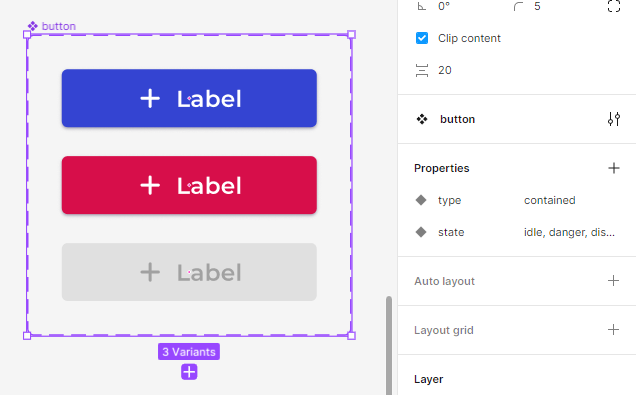
a) The large number of component variants — for example, a button can have multiple instances such as 2 main styles (square and rounded), 3 types (contained, outlined and text), 3 states (idle, danger, disabled), and 3 different sizes (large, medium, small). Every single one of those variants is a separate instance in the main button component, resulting in a total of 54 different variants.

b) The difficulty in changing and updating variants — maybe in large companies where the design system is well established, changes may not be as frequent, however, when a design is still evolving, situations may arise where components must be adapted as the design grows. For example, after a component has been created, it may be necessary to add a leading/end icon, create a new state or a new size. This kind of work can become tiresome in an environment where changes are not uncommon. While many modifications can be made by selecting all or some of the variants, it is often necessary to manually interact with each one individually.
While the button component serves as an example to illustrate the issue, it is a relatively simple component. A select-field, for example, could be even more complex and have many more instances, states, and elements. Imagine having to manage buttons, input and select fields, tabs, tags, and all other components. Furthermore, imagine working as a freelancer and having to recreate or change your components every time you take on a new contract. Couldn’t it be made easier?
2. Structuring components to make managing easier
Figma is a powerful tool that has changed the way we design, helping streamline our work. If it is this powerful, there must be a way to deal with the issue I mentioned, right? Sure! Following, I will share a way to create components that reverberate changes, resulting in fewer variants and making it easier to organize and update.
To summarize, and getting somewhat technical, you will create separated components each using the prior to escalating different aspects. As the title of the article suggests, we will create a cascading logic with our components to stack changes and thus reduce the number of variants.
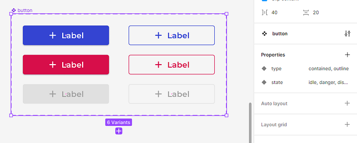
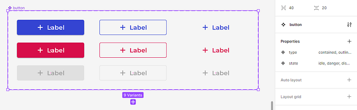
For example, using this method, a button component would have only 14 variants instead of the 54 listed above, looking something like this:

3. Creating the button component using the cascading logic
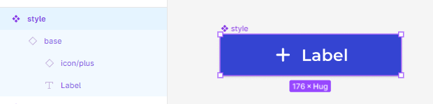
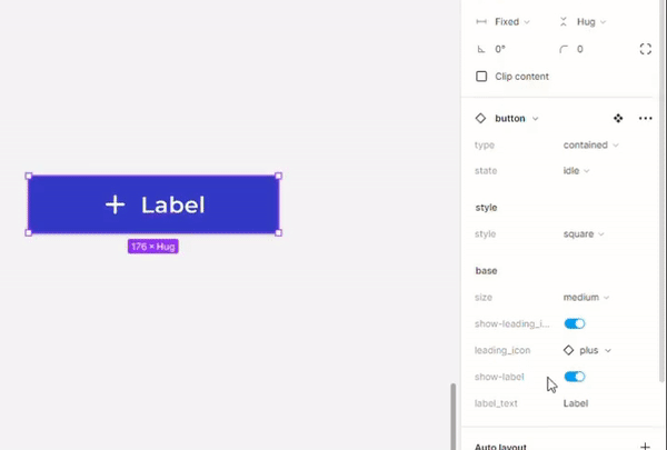
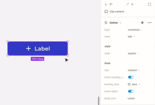
Now, let’s get to work. Open a new design file in Figma and follow along with me. The first step is to create what I call a “base component”, which will have all the most basic elements of the button component. This first step will set the properties of size with 3 variants:

Step 1 —Base: To begin, create a frame, add a label, and an icon. You don’t need to pay attention to specific values, but you can follow the measurements in the image example above. To make the most of this method, add some properties and the crucial auto-layout feature. It’s also appropriate to use styles (color and text) here. If you want to make it exactly like in the example, follow the guide below:
First, create a frame of any size, add an icon (20x20px) to act as our
leading-icon, and a text (16pt body size/20pt line height) to be our
label. Keep in mind that the icon can be a component of its own, so you
can also add an instance swap feature.

Now, add the auto-layout feature (shift+A) and set these values:
- Space between items: 8px
- Horizontal padding: 24px
- Vertical padding: 10px

Set the following frame size constraints (at the top of the sidebar menu):
- Horizontal resizing: FIXED (to adjust to your own UI gridstyle)
- Vertical resizing: HUG

Inside the frame, select the icon frame, and in the sidebar menu panel
add the boolean property "show-leading_icon" in the layer section, so we
can choose whether the button will have a visible icon or not. You can
also add an instance swap property to the icon to change which icon will
be visible.

Now, select the text, and in the layer section of the sidebar menu add
the boolean property "show-label" (so we can make icon buttons).
In the content section, add the text property "label_text" so you can
change the button label with ease
Now, we need to create two additional variants to establish the three different sizes. Set the button you created above as the “medium” sized one. Create a smaller and a larger version. Again, if you want to create it exactly like the example, follow the steps below:
In the "smaller" variant: set the size of the icon to 16x16px.
Set the text/label size to 14pt and line height to 16pt.
Set the vertical padding in the auto-layout to 8px.
Name the variant as "small".
In the "bigger" variant: set the size of the icon to 24x24px.
Set the text/label size to 18pt and line height to 24pt.
Set the vertical padding in the auto-layout to 12px.
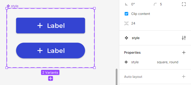
Name the variant as "large".Step 2 — Style: Now, let’s move on to our second step and begin with our cascading logic. Select any variant from the base component and copy it, pasting it to create an instance of it (make sure it’s an instance and not another component altogether; pasting it inside another frame usually helps). Now, select the instance you just copied and create a new component out of it (ctrl/cmd+alt+K), and name it “style”. The component’s layers should look like this:
Now things will begin to get interesting. In this new component, we will make some adjustments to the top layer and then some changes to the base component layer. Firstly, set the component auto-layout size constraints to horizontal = FIXED and vertical = HUG in the sidebar menu. Then, select the base layer inside the component and set the horizontal constraint to FILL (this will make sure the button will adjust to the horizontal size you set).
With these adjustments, the base component will fill the entire width of the parent container, allowing you to adjust the button width according to your grid, giving you more flexibility in terms of design. Additionally, the vertical size adjusts automatically according to the size of the selected variant, maintaining consistency in the vertical size as well.
After that, let’s create two different button styles: square and rounded. Simply create a new variant, make sure to select the base layer inside the component, and change the border radius to 200 (make it a big number so it’s rounded no matter the button size). Don’t forget to name the variants accordingly (“square” and “round”)
To finalize this step, let’s use another property: the newly added (and beta) “expose properties from nested instances”, and choose to show properties from the base instance. By doing this, you’ll be able to inherit the properties controls made in the base layer to the “style” component. Now, you should have something like the following:
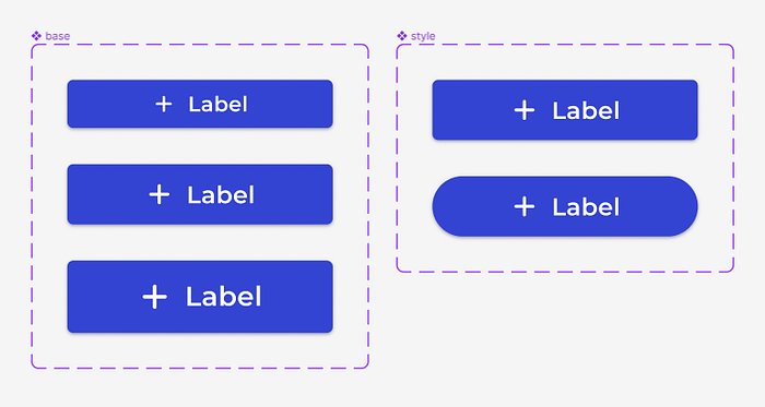
I believe you can understand what’s happening now. The two button styles (square and rounded) are inheriting the size properties from the base component, without the need to explicitly create them.
Step 3 —Types and States: Our next and final step in the cascading ladder is to add types and states to our button component. To begin, do as in the last step and select a variant from our style component (it can be the rounded or squared one, it doesn’t matter), copy and paste it, making sure again it’s an instance and not a new component altogether.
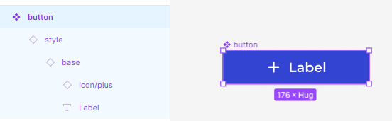
Let’s create yet another component using the copied instance, naming it “button” (since it’s the last step, we need to give it the component’s true name). The layers should look like this:
Make sure to adjust the auto-layout constraints as we did in the last step: set the first/button layer horizontal constraint to FIXED and both layers inside (style and base) to FILL. Don’t forget to add the property “expose properties from nested instances” so you can easily control the inherited properties from the base and style components.
Going forth, we will create the different types of the component: contained, outline and text, and it’s states: idle, danger and disabled. So, create two new variant properties with the respective names: type which for the selected variant should be “contained” and state, which should be “idle”. Now, we will start creating the other states. Add a new variant and change it’s color to red, naming its state property to “danger”. Add another variant, name its state property “disabled”, change the button fill color to grey and the label/icon to a more darker grey (when dealing with disabled states, I usually change it’s opacity to 70%). The component should look like:
Right, now that we have established our states, copy one of the variants and name its type property to “outline”. To exact our changes and add the new type of the component, you will need to adapt it in the base layer, changing the icon and label/text color, removing its fill and adding a stroke of the same color (so, blue for the idle state, red for the danger state and grey for the disabled state). Create the 3 state variants for the outline type, so we can have our component with 6 variants:
Lastly, we need to create our final type variant: the text. Select all 3 outline variants, copy and paste it, renaming the type property name to “text”. Now, just remove the stroke of each one of the text type variants and voilà, your button component should be finalized:
Step 4 — What have we accomplished?: So, after all that effort, our component is ready to be used. Essentially, as stated in the beginning, we created a component with potential 54 variants but only using 14. But not only that, all changes you make to the base component will reverberate and be applied to the subsequent steps of the component. Feel free to experiment, add new elements and properties, or remove them, so you can observe the changes being applied as a cascade in real time.

Oh, and if you are using this component in a library file, just remember to hide the base and style components so only the final button component can be utilized. This will ensure that users of the library only have access to the final version of the component, making it easier for them to work with and reducing the risk of errors.
4. Final thoughts and considerations
As I mentioned previously, the button is a simple enough component to be used as an example in this article, but the method can be applied to other components with a few adjustments. Essentially, any component that has variants can be created and benefited by this method. My goal is to refine it even further, so the first step/base has only one variant.
Sadly, elements that have fixed value sizes, like the icon, cannot be changed in later steps, so they need to be set in the first step, demanding more initial variants.
Also, this method has its own limitations. While Figma is a powerful tool, it may not always handle different properties as expected. After the component is finalized, when you are using it and selecting which state, style, type, and so on, you want to have, going back and forth can cause the component to malfunction. I’ve realized that the order in which the changes are applied matters, so it’s important to make a coherent order with the properties. Despite these limitations, this method can still greatly improve your workflow and make it easier to manage and update your design components.
You can see below that selecting each property in the order proposed goes smoothly.
Still, my advice is to know beforehand what properties you will be using and select them without changing back and forth.
Changing colors can also sometimes be problematic and may not apply correctly. For example, when you change the state, sometimes the right color isn’t applied to the icon. Despite these issues, the method has come a long way and today it works much better than when I first started using it, particularly with the recent beta feature that allows you to expose properties from nested instances. Before this update, the task was to manually select each layer and apply the changes, which was time-consuming but manageable.
Maybe with this article the Figma team will notice it and somehow patch it? 😅
5. Next steps
I plan to create a video tutorial that will provide a step-by-step guide on how to create the component, making it even easier to follow. I will share the tutorial here as soon as it’s finished.
Also, with this article published, I hope to receive feedback and insights on how the cascading method can be improved. If you are reading this, please don’t hesitate to share your thoughts and ideas on the matter. 😊
Don’t hesitate to check Figma’s own documentation, which provides a wealth of information to enhance your skills. For testing and refining this approach, I personally recommend reading the following sections: ‘Create and Use Variants’, ‘Explore Component Properties’, and ‘Create and Manage Component Properties’.
I want to thank you for reading and I hope that this article has been helpful in showing a different way to organize components in Figma
See ya! 👋

